
An accented neutral color scheme is about striking the perfect balance between subtle and bold. At its core, this approach uses calming neutral tones—like beige, gray, or taupe—as a foundation while adding pops of vibrant colors for contrast and personality. The secret to making it work? The 60-30-10 rule: 60% neutral base, 30% complementary neutrals, and 10% bold accent colors.
This strategy is a favorite of interior designers because it combines timeless elegance with flexibility. Whether you’re looking for something serene and classic or a bit of vibrancy to energize a room, accented neutrals can do it all. So, how do you make it work in your space? Let’s break it down.

Key Takeaways About Accented Neutral Color Palettes
- An accented neutral color scheme combines neutrals with vibrant accents to create balanced, inviting interiors.
- The 60-30-10 rule guides the distribution of three colors: 60% primary neutral, 30% secondary neutral, and 10% accent.
- Neutral base colors like gray, beige, or taupe establish a serene, versatile backdrop.
- Accent colors such as teal or mustard yellow add vibrancy and emotional depth to the space.
- This scheme is popular in modern and minimalist styles for its aesthetic harmony and adaptability.
Why Accented Neutrals Work So Well
The magic of accented neutrals lies in their versatility. The neutral tones create a calm, grounded backdrop that makes a space feel open and cohesive. Accent colors, on the other hand, bring energy and interest, preventing the space from feeling flat or dull.
- Flexibility: Updating a space is simple—swap out your accent colors in accessories like throw pillows, rugs, or artwork.
- Timeless Appeal: Neutrals never go out of style, and paired with the right accents, they can adapt to any trend.
- Mood Setting: Neutral backdrops offer serenity, while accents add emotional depth—whether a cheerful yellow or calming blue.
Accented neutral color schemes are a bonus for open floor plans. Because neutrals are restful on the eyes, continuing neutral-colored walls and floors throughout the entire space isn’t visually overwhelming. In addition, you can define separate spaces by choosing accent colors that are different but work together in an overall color scheme.
One interesting factor of using an accented neutral color scheme is that it works without consulting the color wheel (assuming you’re not using multiple accent colors). Neutral colors like brown aren’t anywhere on the color wheel.
Choosing Your Neutral Base
Start with your primary neutral tones—these will cover about 60% of your space, including all blank walls, flooring, or large furniture pieces. Consider:
- White or Off-White: Clean, fresh, and perfect for making small spaces feel bigger.
- Beige or Taupe: Warm and cozy, ideal for creating an inviting atmosphere.
- Gray: Cool and sophisticated, offering a modern, minimalist vibe.
Your chosen neutral should reflect the light in your space and complement any accent colors you’re drawn to. For instance, soft gray walls can be the perfect canvas for bolder colors like mustard yellow or emerald green.
Selecting Accent Colors
An accent color stands out from the neutrals and adds contrast, depth, and interest to a design or space. It can also draw attention to specific elements in a design or add vibrancy to an otherwise neutral space.
Accent colors are where your personality comes through. These small pops of vibrancy (making up 10% of the room) can change the mood and energy of your space. Think about the vibe you want to create:
- Warm and Cozy: Use earthy tones like terracotta, rust, or deep reds.
- Fresh and Invigorating: Bright hues like teal, mustard yellow, or coral add life and energy.
- Calm and Relaxing: Stick to cool tones like soft blues, greens, or muted lavender.
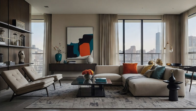
Accent colors with high saturation tend to pair well with cream and other light neutrals like white and light gray. Additionally, darker neutrals like black and dark gray go well with sharp accents. In either case, the neutral and accent colors have enough contrast to create visual interest and let the accent color pop.
Accent colors with low saturation, such as pastels, are good for a delicate touch of color. They work better with light neutrals so that the accent color can shine. Dark neutrals, like black, would create too much contrast and draw the eye away from the pale accent.
Use accents thoughtfully: choose artwork, cushions, decorative vases, or a statement chair with an eye for how it affects the rest of the space. A little goes a long way, so don’t overdo it!
Using Multiple Accent Colors
While using more than one color as an accent is possible, it’s easy to use too many accent colors. If one accent color isn’t enough, try using varying shades of the same color rather than different colors. 10% already isn’t a lot of visual real estate, and splitting it up further can weaken the harmonious effect.
On the other hand, high-contrast color schemes like complementary colors can feel overwhelming without a neutral base, so can be a good choice for a palette with multiple accent colors. Analogous colors, such as red, orange, and yellow, have an internal harmony, so are another good choice.
Accented Neutrals in Action
Here are some practical examples to inspire your own space:
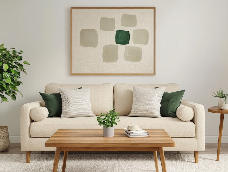
- Living Room: Start with light gray walls and a neutral sofa. Add interest with deep teal throw pillows, a patterned area rug, and gold or brass accents for a touch of glam.
- Bedroom: Pair beige walls with soft white bedding. Bring warmth with terracotta throw blankets, rust-toned cushions, and wooden side tables.
- Kitchen: Keep the cabinetry white or taupe. Add personality with colorful bar stools or a bold backsplash in emerald green or sunny yellow.
- Bathroom: Use neutral tiles as your base and introduce accents with towels, wall art, or a brightly colored soap dispenser.
Depending on your room layout, a narrow accent wall could fit within your 10%. An accent chair could also be a visual anchor for your bright color.
Tips for Making It Work
- Follow the 60-30-10 Rule: For a balanced look, use 60% neutrals, 30% secondary neutrals, and 10% accent colors.
- Play with Textures: Layer different textures—like linen, wood, or leather—in your neutral palette to add depth without needing more color.
- Think Seasonally: Swap out your accent colors with the seasons. Pastels for spring, vibrant hues for summer, earthy tones for fall, and cozy deep shades for winter.
- Focus on Key Areas: Use accents strategically, such as a standout piece of art, colorful throw pillows, or an eye-catching vase.
Enhancing Your Space With Accents
The beauty of decorating your home with an accented neutral scheme is how dynamic it can be. While neutrals provide a timeless foundation, your accents are where the fun happens. Want to highlight a unique architectural feature? Use an accent color. Need to refresh the space? Change out a few accessories—new cushions, throws, or a statement lamp can completely transform the room.
By carefully balancing the neutral backdrop with pops of color, you’ll create a lively space that is never overwhelming.