
Cream is the ultimate neutral for an accented neutral palette—a warm, inviting canvas that complements almost any color. Whether you’re drawn to the elegance of navy blue, the softness of blush pink, or the vibrancy of mustard yellow, cream offers endless possibilities for creating beautiful spaces. It’s a color that can feel serene, sophisticated, or lively, depending on how you pair it. Let’s explore what colors go with cream and how it can bring out the best in a variety of hues.
Color Palette Ideas for Cream
- Navy blue adds sophistication and contrast to cream, perfect for formal spaces.
- Blush pink pairs with cream for a soft, romantic aesthetic.
- Gray introduces modern minimalism and balances cream’s warmth.
- Olive green creates a rustic, nature-inspired look with cream.
- Mustard yellow energizes cream interiors, adding vibrancy and cheerfulness.
Cream with Vibrant Accents

Cream’s soft, warm tone makes it the perfect neutral backdrop for vibrant, high-energy complementary colors like orange and teal. These bold hues pop beautifully against cream’s subtle elegance, creating spaces that feel lively yet balanced.
Cream and Navy Blue: Timeless Sophistication

Pairing cream with navy blue creates a classic and refined aesthetic that suits both formal and casual settings.
- How to Use It: Use navy blue as an accent against cream walls or furnishings. Incorporate geometric patterns or sleek upholstery for added visual interest.
- Styling Tip: Add metallics like gold or brass to enhance the luxurious feel of this combination.
- Where It Shines: Living rooms, dining rooms, and coastal-themed spaces thrive with this timeless palette.
Cream and Blush Pink: Soft and Romantic
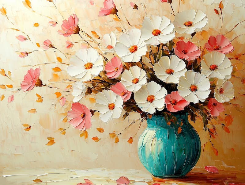
For a touch of elegance and femininity, pair cream with blush pink. This duo creates a warm, inviting atmosphere that’s perfect for bedrooms or nurseries. Introduce a bright accent color for a stunning 60-30-10 color palette.
- How to Use It: Layer blush pink accents, such as throw pillows or bedding, on a foundation of cream walls or furniture.
- Styling Tip: Introduce soft gray or muted earth tones for added depth and sophistication.
- Where It Shines: Ideal for serene bedrooms or vintage-inspired living spaces.
Cream and Gray: Modern Minimalism

Combining cream with gray creates a balanced, minimalist aesthetic that’s both warm and contemporary.
- How to Use It: Pair light gray with cream for a soft, calming vibe, or use charcoal gray for a bold, dramatic contrast.
- Styling Tip: Add textural elements like a plush gray sofa or sleek cream vases to enhance visual interest.
- Where It Shines: Works beautifully in modern living rooms, offices, or bathrooms.
Cream and Olive Green: Rustic Elegance
For a nature-inspired palette, pair cream with olive green. This combination evokes a rustic, earthy charm that feels grounded and serene.
- How to Use It: Incorporate olive green through cabinetry, throw blankets, or plants against cream walls or furniture.
- Styling Tip: Add wooden textures or terracotta accents to enhance the natural, organic feel.
- Where It Shines: Perfect for kitchens, dining areas, and eco-friendly interiors.
Cream and Brown: Luxurious Depth
Warm browns paired with cream create a rich, sophisticated ambiance.
- How to Use It: Introduce colors with warm undertones like browns, oranges, and yellows through textiles like curtains, cushions, or area rugs. Use cream as the base color to balance the intensity.
- Styling Tip: Incorporate metallic finishes like bronze or gold to enhance the opulence of this palette.
- Where It Shines: Perfect for dining rooms, living rooms, and event decor.
Cream and Teal: Vibrant Sophistication

Teal’s boldness contrasts beautifully with cream’s softness, creating a lively yet balanced look.
- How to Use It: Use teal as an accent wall or in smaller decor pieces like throw pillows and rugs to complement cream furniture.
- Styling Tip: Add gold accessories for a polished finish that ties the look together.
- Where It Shines: Ideal for coastal homes, bedrooms, or living rooms.
Create Warmth and Elegance With Cream
Cream is a timeless neutral that effortlessly pairs with a variety of colors, making it an unsung superhero when you’re choosing colors for interior design. From the sophistication of navy blue to the vibrancy of mustard yellow, each pairing offers unique possibilities to personalize your space. Whether you want to create a cozy, rustic vibe with olive green or add a touch of luxury with burgundy and gold, cream provides the perfect foundation. So, where will you let cream take your design next?