
Choosing the right color scheme can be intimidating when decorating your home, but it doesn’t have to be. But by keeping a few principles in mind, the process can be much easier. Understanding the psychology of color and following practical interior design color tips can help you create a space that’s not only beautiful but also cohesive and inviting. By paying attention to how color impacts mood and perception, you can choose an interior design color scheme that feels visually appealing and comfortable.
5 Tips for Interior Color Schemes
- A focal piece with several colors can help you develop your color palette.
- Aim for three to five colors to keep the design balanced.
- Use the 60-30-10 rule to create a proportional color scheme.
- Add depth and variety with tints, tones, and shades.
- Use color psychology to create a specific mood.
How Many Colors for a Room Color Palette?
Deciding on the number of colors is key to achieving a balanced space. Interior designers often recommend three to five complementary colors for a cohesive look.
Choosing fewer than three colors may result in a monotonous or overly coordinated appearance, while using more than five colors could lead to a cluttered and chaotic feel. Sticking with three to five colors helps ensure they work well together and keep the space interesting.
Incorporating the chosen colors’ tints, tones, and shades to add depth and dimension can create a more nuanced and sophisticated look. Because they’re in the same color family, adding variety this way will still look cohesive.
The 60-30-10 Rule
This popular rule helps create a balanced look by dividing colors into three parts: 60% for the dominant color, 30% for a secondary color, and 10% for an accent color. This approach gives structure to the color scheme, helping avoid overpowering any shade. Following this rule brings harmony and adds visual interest by balancing dominant, secondary, and accent colors.
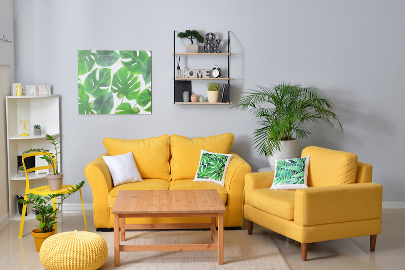
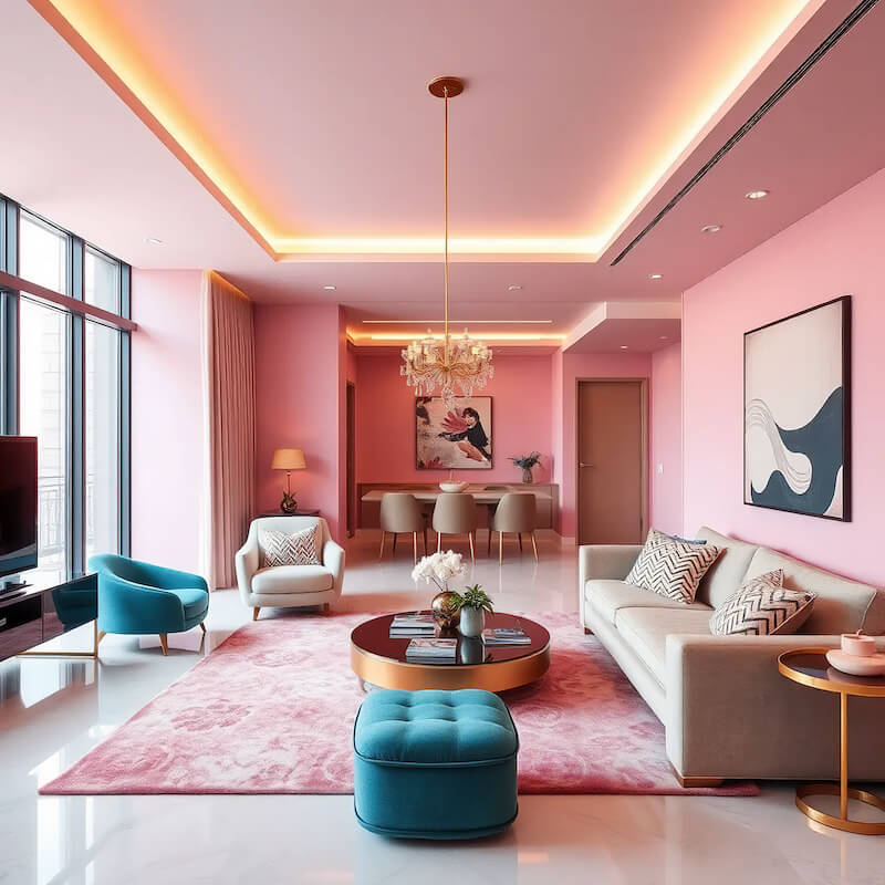
Remember that the walls and floors are part of the 100%. For example, you might have a room with warm-toned brown wood floors, so you might choose warm-toned colors to go with that neutral color. Pale yellow walls, a rug, throw blankets, and pillows could be your 60%. A secondary color, such as terracotta, could be used for the curtains, sofa, and accent chair. A contrasting accent color, such as teal, could pop in the form of wall art and table decoration.
Neutrals work well as primary or secondary colors since they complement various colors and prevent vivid, bold colors from overwhelming a space.
Easy Ways to Pick a Room Color Palette
Need a bit of inspiration? It could be as close as a Pinterest mood board.
One simple way to find a harmonious interior design color scheme is to find an image online that reflects the mood you want to create. It doesn’t have to be a home interior, either! It could be an outfit on a fashion site, a pretty landscape photo, or even something from a food blog, as long as it evokes the right vibe. Use a color picker tool to sample three or four of the picture’s primary colors. Since the image looks good to you, the main colors will likely work well together.
Another approach is to look at your existing decor or choose a new focal piece you love, like a piece of wall art or a patterned rug. Select a few colors from this focal piece and incorporate them throughout the room for cohesion. Since all those colors are included in a prominent decor piece, they’ll all be tied together.
Additionally, starting with your favorite color and then using color theory to choose complementary accent colors can be a straightforward way to build a color palette you enjoy.
Tips for Picking a Whole House Color Palette
You’ll probably need a few more colors to create a cohesive look throughout your house to avoid an overly curated look. Aim for six or seven colors (plus their tones, tints, and shades).
Choose your dominant color by choosing a room to be the main focus of the house. For example, you might choose your kitchen or the living room. This room’s dominant color will become the dominant color of the whole house palette.
Once you have this dominant color to build your palette around, the secondary colors can be used as the dominant colors in connected rooms. The dominant color can be the accent color to tie your rooms together even more visually.
To ensure a harmonious visual flow, walk through your house while planning, noting which rooms are visible from other rooms. Make sure these rooms have a cohesive color palette. If a room has a closing door, it’s easier to make a larger color shift feel natural.
The scale of each room can also help inform which color you use. Lighter colors can make large rooms feel even larger, while darker colors can help them feel cozier and more intimate. Small spaces like half-baths and laundry rooms are good candidates for bold and accent colors. The small surface area will keep the color from overwhelming the overall house. Out-of-the-way rooms like basements are also good places to experiment more with color choices.
Color Schemes: Using the Color Wheel
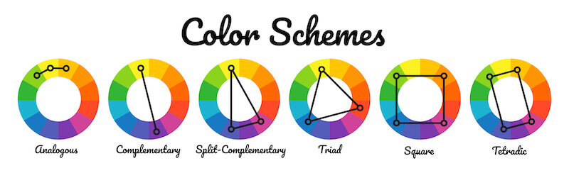
The color wheel is a valuable tool for selecting a balanced palette. All the colors of the rainbow are situated in a ring, making it easy to choose color complements. You’ll notice that black, white, and neutrals like brown aren’t part of it.
Starting with your dominant color, you can use the color wheel to pick colors that complement each other in various ways:
- A monochromatic color scheme: This usesvarious tints, tones, and shades of a single color. While cohesive, it can sometimes make a space feel overwhelming.
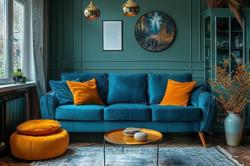
- Analogous color scheme: Selecting colors next to each other on the color wheel, such as purple, blue, and green, creates a more restful palette.
- Complementary color scheme: Choosing opposite or near-opposite colors on the color wheel creates a dynamic, energetic feel.
By understanding these and other color schemes and how they work together on the color wheel, you can create a balanced and visually pleasing color palette for your home.
Color Psychology: Creating a Mood with Color Palettes
Color psychology is essential for evoking a specific mood with your home’s color palettes. By understanding the impact of various colors, tints, tones, and shades, you can create the atmosphere you envision.
Colors and Hues
Often overlooked but undeniably impactful, color psychology is a powerful tool in interior design, capable of shaping the mood and ambiance of a space. Here are the basics of which colors to use to create various moods:
- Red: Energy, passion, excitement; can increase heart rate and evoke strong emotions, often used to develop a sense of warmth and urgency.
- Orange: Enthusiasm, creativity, and warmth; stimulates social interaction and creates an inviting, energetic feel.
- Yellow: Happiness, optimism, and warmth; associated with sunlight, it can enhance focus and create a cheerful, positive atmosphere.
- Green: Balance, growth, and tranquility; linked to nature, it promotes relaxation and a sense of calm, often used to bring a refreshing or restorative feel.
- Blue: Calm, trust, and reliability; known for its soothing qualities, blue can create a peaceful, secure environment, often used for office or bedroom decor.
- Purple: Luxury, creativity, and spirituality; associated with royalty, it can add a sense of depth, mystery, and sophistication.
- Pink: Compassion, warmth, and playfulness; softer shades evoke calmness, while brighter tones create a lively, youthful vibe.
- Brown: Stability, warmth, and comfort; an earthy tone that creates a grounded, cozy environment, often used for a natural or rustic feel.
- Gray: Balance, neutrality, and sophistication; versatile and calming, gray provides a modern, elegant backdrop that complements most color schemes.
- Black: Power, sophistication, and elegance; adds depth and drama.
- White: Purity, simplicity, and cleanliness; enhances space and light, creating an open and airy feel; often used as a base or to create a minimalist look.
Tints, Tones, and Shades
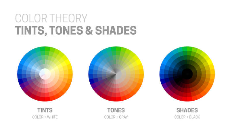
Playing with tints, tones, and shades of a color can add richness and variety to your design.
Tints, created by adding white to a base color, can evoke feelings of vintage charm, childlike whimsy, or classic elegance. These pastels can brighten and open up a room, giving it an airy feel.
Tones, created by adding gray to a base color, offer a softer, more muted appearance, ideal for creating a calming atmosphere for a doctor’s office or home office. The desaturation can help bold color choices look more neutral.
Shades, created by adding black to a base color, introduce depth and richness to a space.
Darker shades like navy blue can be balanced by lighter tones or used to cultivate a cozy and intimate setting.
Consider tints, tones, and shades when selecting colors for furniture pieces or paint swatches.
Warm Colors vs. Cool Colors
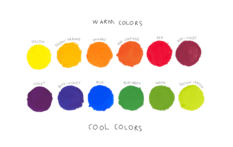
The color wheel can generally be divided into half: reds, yellows, and oranges vs. blues, greens, and purples. The “warm colors” and “cool colors” each have visual and psychological effects.
- Warm shades like reds, oranges, and yellows can create a cozy and inviting atmosphere, making a room feel more intimate and energetic. Visually speaking, warm colors have the illusion of being closer than they are, so can make a space feel smaller and cozier.
- Cool shades such as blues, greens, and purples promote a sense of calm and relaxation, ideal for spaces where serenity is desired. Visually speaking, cool colors recede into the background, making a space feel larger.
Understanding the undertones of your interior design color palette is essential. For example, teal is a “warm” blue because it’s mixed with a little bit of yellow.
This is vital when choosing neutrals, such as a warm white vs. a cool white. While it may seem like a small difference, choosing the wrong option can clash with the entire rest of your palette. Grays are especially tricky since they can sometimes shift in different lighting conditions!
Strategically incorporating warm and cool shades in a color palette can greatly influence a room’s mood and feel. Experimenting with different hues and undertones within these color families can help you achieve the perfect feel you’re going for.
Using Neutral Colors in Interior Design
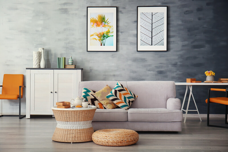
Neutral colors like white, beige, and gray provide a timeless foundation and allow other design elements to stand out. They provide a calming backdrop that allows furniture and decor to stand out, creating a harmonious atmosphere.
Incorporating texture and varying shades of neutrals can add depth and visual interest to a space, enhancing its overall appeal.
Neutral colors also adapt well to changing trends and shifts in personal preferences. If you use neutrals for major fixtures, such as flooring and large furniture items, it’s easy to swap out accent pieces or repaint the walls to change the color palette.
Neutral colors’ ability to act as a canvas for other interior design elements while promoting a sense of harmony makes them a popular choice in interior design.
Examples of Color in Interior Design
So, how do you put all this together? Here are a few quick examples:
Toned-down greens and neutral, earthy tones can create a relaxed, calming feel inspired by nature.
Complementary colors cause contrast to evoke energy, while high saturation makes them bolder.
For a soothing, dreamy ambiance, an analogous palette with low contrast, using similar hues with similar intensity, could be ideal.
Want to create a sophisticated palette with a hint of fun? Try a palette of tints, tones, and shades of cool colors, with the only “true” color being a bright, warm accent color like magenta.
Free Online Color Palette Generators
Coolors lets you explore ready-made and trending color palettes or generate your own. Whenever you see a color you want to keep, you can lock it and keep generating to get colors that go with your picks. If you already have one or more colors in mind, you can create them with the color sliders and lock them in. It even lets you upload photos to automatically extract color palettes; it also has tools to change saturation, warmth, and more! The free version enables you to generate up to five colors, though you can manually build a palette of up to 10.
Paletton is a great tool for generating formal color schemes. It features an interactive color wheel. Choose from monochromatic, triadic, tetrad, and even freestyle palettes. The tool also supplies tints, tones, and shades for the selected colors, making your potential palette easy to visualize. It has preview examples to see how the palette works in various ratios.
Khroma is an AI-driven tool that helps you find colors you like by having you choose from sets of colors. The AI gradually learns your preferences and builds color palettes based on your tastes.
Color Hunt is a user-driven tool where you can browse thousands of curated color palettes and search by color, mood, or theme. You can also manually create your own color palette and submit it to the collection for inclusion.
ColorSpace asks you to enter a dominant color and supplies palettes that go with it, ranging from three to six colors. While you can’t save palettes, the tool supplies you with the colors’ hex codes so you can find them again later.
Ready to Make Your Space Look Good?
Choosing a color palette is like painting a canvas. You can create a balanced and harmonious design by selecting a handful of colors that work well together and following the 60-30-10 rule. Adding tints, tones, and shades brings depth and expands your decorating options. Let your color palette reflect your style and personality, creating a space where your self-expression takes center stage.