
Have you ever walked into a room and instantly felt more energized, creative, and alive? That’s the magic of orange—a color that infuses spaces with warmth, creativity, and undeniable vitality. From the soft blush of a sunset to the vibrant pop of citrus, orange has the remarkable ability to transform any space from ordinary to extraordinary.
The secret to decorating with orange lies in finding its perfect companions. The right color combinations can elevate orange from simply bold to brilliantly balanced, creating interior design palettes that feel both energizing and harmonious. Whether your taste leans toward sophisticated and subdued or playful and vibrant, orange’s versatility offers endless possibilities for your walls and art selections.
The 5-Minute Orange Refresh:
Ready to transform your space with orange’s energy immediately? Here’s your quick-action plan:
- The Focal Point Strategy: Select one statement piece of orange artwork for your main living space. Position it at eye level where it naturally draws attention when entering the room. Pull one or two additional colors from the artwork to incorporate throughout the space in smaller accessories.
- The Color Wheel Secret: Place your orange art piece against a blue wall or with blue accessories nearby—this complementary pairing instantly creates visual harmony while maximizing impact.
- The Neutral Foundation: If decorating feels overwhelming, start with completely neutral walls and furniture, then add an orange abstract print or photograph as your room’s personality piece. This accented neutral approach provides maximum flexibility with minimum risk.
- The Seasonal Rotation: Invest in two different orange-toned art pieces—one in deeper burnt orange for fall/winter and another in brighter citrus tones for spring/summer. Swap them seasonally for an instant room refresh.
- The Gallery Effect: Create an instant collection by grouping three related orange-toned prints together. Arrange them either horizontally at eye level or vertically to draw the eye upward and create the perception of higher ceilings.
Orange Palette Cheat Sheet
- Complementary blues: Navy, cobalt, or sky blue create perfect balance with orange, offering sophisticated depth or airy brightness depending on intensity.
- Earthy neutrals: Warm browns, olive greens, and soft greys provide grounding contrast while allowing orange wall art to become the focal point.
- Monochromatic magic: Cream, terracotta, and pale coral create a layered, cohesive palette that adds depth without overwhelming.
- Bold statements: Teal, magenta, or sunny yellow paired with orange create energetic, playful spaces perfect for creative rooms or vibrant gallery walls.
- Subtle sophistication: Beige, pale blue, or muted coral create warm, inviting spaces with orange as an elegant accent.
Blue: The Perfect Canvas for Orange Artwork
The most dynamic relationship in the color spectrum exists between orange and blue—complementary colors that sit opposite each other on the color wheel. This natural tension creates spaces with perfect visual balance and undeniable energy.
Navy blue and orange: This timeless pairing creates instant sophistication. Against navy walls or furniture, orange art pieces become statement focal points with unexpected elegance. The deep blue tames orange’s boldness while orange infuses richness and warmth into what might otherwise feel austere.
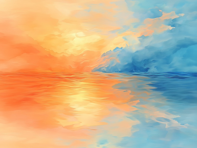
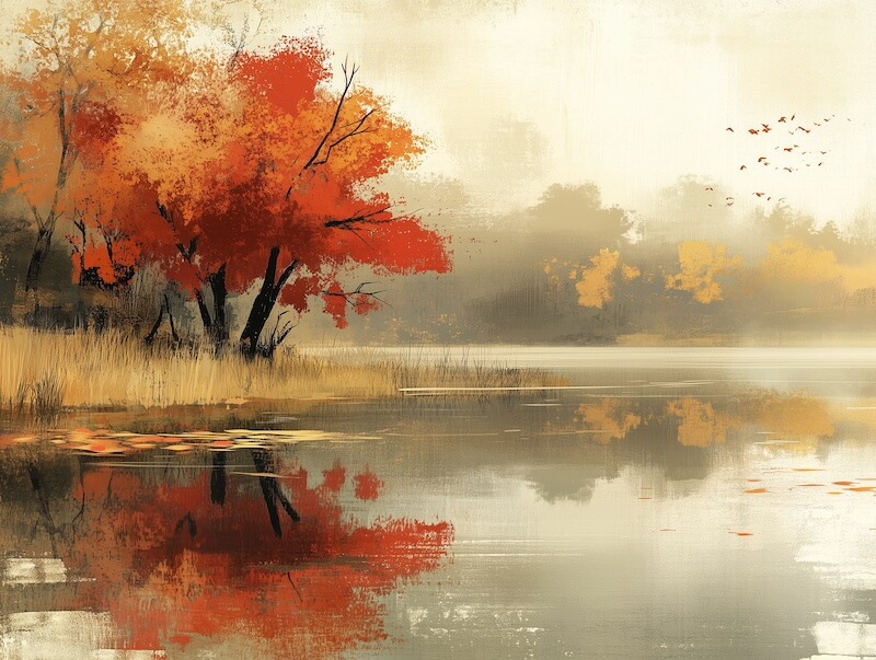
Sky blue and tangerine: For spaces that need to feel open, airy and full of light, this combination delivers brightness without overwhelming. A landscape painting featuring sunset oranges against a blue sky creates an instant window in any room, expanding the sense of space and bringing natural harmony.
For a slightly unexpected twist on complementary color theory, pair orange with olive green—close to blue on the color wheel but with an earthier quality. Abstract art featuring these tones creates sophisticated depth with a modern, organic feel. Consider framed prints with orange and green elements against a neutral grey backdrop for a contemporary look that feels both fresh and timeless.
Monochromatic & Neutral Pairings That Showcase Orange Art
Sometimes the most impactful approach is the most restrained. Monochromatic and neutral palettes create harmony and sophisticated elegance while allowing orange elements to shine.
When utilizing the classic 60-30-10 design rule, consider making orange your 10% accent color through carefully selected artwork. Against dominant neutral walls and secondary furnishings, orange art pieces become powerful visual anchors that draw the eye and add personality without overwhelming.
Burnt orange with creamy neutrals: A rich, deep orange artwork against cream walls creates warmth and subtle sophistication. This pairing works beautifully in decorating bedrooms or living areas where you want both impact and tranquility. Abstract canvas prints featuring textured burnt orange against neutral backgrounds add depth and dimension.
Charcoal and orange: For contemporary drama that remains refined, nothing compares to the contrast of deep charcoal grey with vibrant orange. A series of orange-toned prints in black frames against a charcoal accent wall creates a gallery-worthy focal point in any space.
Bright white foundations: For the most contemporary, gallery-like setting, crisp white walls make orange art pieces pop with unmatched clarity. This clean backdrop allows the full spectrum of orange—from coral to rust—to display its true depth and character.
Bold & Vibrant Combinations for Statement-Making Orange
For those unafraid of color and looking to create truly memorable spaces, orange thrives in bold, unexpected combinations that energize and inspire.
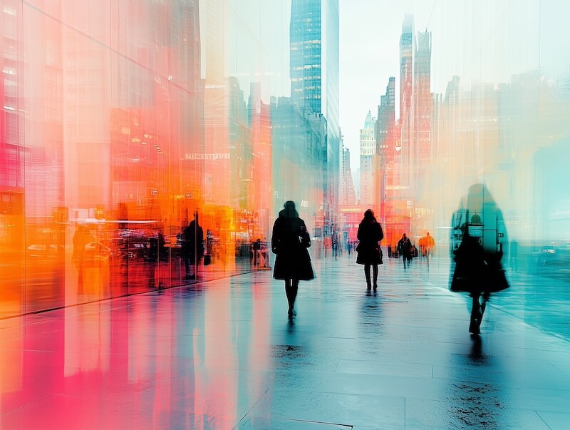
Electric blue and orange: This high-contrast pairing creates spaces with undeniable visual impact. Abstract art featuring these tones becomes an instant conversation piece and energy center in contemporary spaces. Look for stretched canvas prints that play with these vibrant complements.
Magenta and orange: For spaces that celebrate creativity and artistic expression, this combination delivers joyful sophistication. Botanical prints featuring orange flowers against magenta backgrounds—or the other way around—bring this dynamic pairing to life on your walls.
Deep purple and orange: Create dramatic tension and unexpected elegance with this rich combination. Portrait photography or abstract paintings featuring these tones bring depth and character to formal spaces like dining rooms or studies.
Sunshine yellow and orange: Nothing creates a more cheerful, welcoming atmosphere than this pairing. Landscape artwork featuring these sunny tones benefits kitchen spaces and decorating casual living areas, instantly brightening even the darkest corners.
Earthy & Warm Orange for Organic Elegance
For spaces that need to feel grounded, inviting and timeless, orange pairs beautifully with earth tones in an accented neutral color palette.
Terracotta and walnut: This combination evokes natural materials and organic textures. Look for landscape photography or abstract pieces featuring these warm tones to create spaces with immediate comfort and sophistication. A collection of framed prints in varying sizes creates visual interest while maintaining harmony.
Rust and cream: For a softer approach to earthy orange, this pairing delivers warmth without heaviness. Botanical illustrations or vintage-inspired artwork featuring these tones bring subtle character and natural elegance to any room.
Apricot and sage green: This combination connects directly to nature’s own palette, creating spaces that feel fresh yet grounded. Landscape art featuring distant mountains at sunset or botanical prints with soft orange flowers against green foliage bring this harmonious combination to your walls with effortless style.
Soft & Subtle Orange for Serene Sophistication
Not all orange statements need to be bold—the softer side of this versatile color creates spaces of unexpected tranquility and refined elegance.
Pale coral and warm white: This ethereal combination brings a glow to any space, creating rooms that feel bathed in perpetual sunset light. Abstract watercolor prints featuring these gentle tones add sophistication without overwhelming when you’re decorating bedrooms or reading nooks.
Blush orange and light grey: For a contemporary yet gentle approach, this pairing offers subtle depth with modern restraint. Minimalist art pieces or photography featuring these tones create a quiet impact perfect for spaces dedicated to contemplation or conversation.
Peach and powder blue: This delicate combination evokes vintage charm with contemporary relevance. Still-life paintings or botanical prints featuring these soft tones bring gentle character to bathroom decor, bedrooms, or any space where calm prevails.
Contemporary Design Ideas Showcasing Orange Art
Modern spaces benefit from orange’s ability to add warmth and personality without compromising clean, architectural lines.
Focal point philosophy: In contemporary design, a single large-scale orange abstract canvas against minimalist grey or white walls creates architectural impact and becomes the room’s defining feature. Hang oversized prints with textural elements for maximum effect.
Color blocking: Modern spaces excel with deliberate color placement. A navy blue accent wall featuring a collection of framed orange prints creates a sophisticated gallery effect that draws the eye and anchors the space.
Material contrast: Contemporary design thrives on juxtaposition. Orange artwork featuring natural textures against sleek materials like concrete, glass or steel creates dynamic tension. Look for photographic prints of natural orange elements—rust, canyons, autumn leaves—to complement industrial spaces.
Geometric precision: For thoroughly modern spaces, geometric orange art with clean lines and precise forms adds warmth without compromising contemporary aesthetics. Limited edition prints featuring orange geometric patterns create visual interest while maintaining design discipline.
Orange for Different Design Styles

The chameleon-like versatility of orange allows it to enhance virtually any design aesthetic when paired thoughtfully with appropriate artwork.
Modern minimalism: When you’re using minimalist design, a single bold orange artwork is a perfect candidate to become a room’s defining feature. Look for abstract pieces with clean lines and bold forms against neutral backgrounds of white, grey or black. The restraint of the surrounding space allows the orange element to command attention without competition.
Bohemian expressions: Orange thrives in bohemian interiors, complementing layered textures and global influences. Gallery walls featuring a collection of orange-toned artwork—from landscape photography to abstract paintings—create curated eclecticism. Look for pieces incorporating earthy oranges with rich textiles or natural motifs.
Industrial warmth: The inherent warmth of orange provides the perfect balance in industrial spaces dominated by cool materials. Large-scale photography featuring rust, brick, or urban sunsets brings organic warmth to concrete and steel environments. Look for pieces that celebrate the beauty of weathered industrial elements in orange tones.
Mid-century modern classics: Orange was fundamental to mid-century design, making it a natural choice for these spaces. Artwork featuring geometric patterns or abstract forms in burnt orange paired with teal, olive, or mustard creates authentic retro character. Look for prints inspired by modern art and mid-century design motifs.
Contemporary coastal: For a fresh take on coastal wall decor, soft orange paired with navy, aqua, and sand tones creates sophisticated seaside elegance. Sunset seascapes or abstract pieces evoking coastal light bring this palette to life without resorting to clichés.
Seasonal Transformation with Orange Art
One of orange’s most remarkable qualities is its seasonal adaptability. Rotating your orange artwork creates spaces that evolve throughout the year while maintaining a cohesive design.
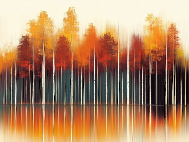
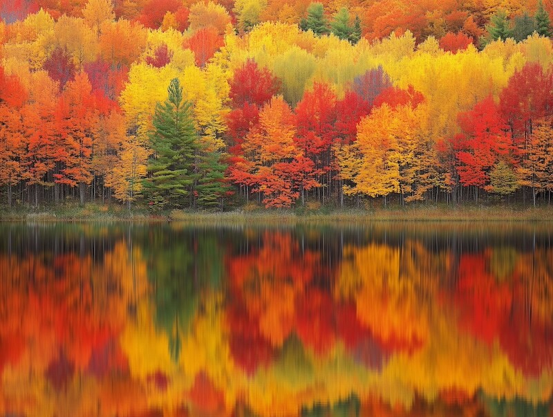
Autumn abundance: Deep burnt orange artwork featuring rich textures—from abstract landscapes to still life compositions—creates spaces that embrace fall’s natural warmth. Pair with deep browns, forest greens, autumnal reds, and creamy neutrals through complementary textiles and accessories.
Summer vibrance: Bright citrus orange in abstract or botanical prints brings perpetual sunshine during warmer months. Paired with fresh whites, ocean blues, or leafy greens, these artwork selections create spaces that feel alive with summer energy.
Winter warmth: During colder months, orange artwork becomes even more impactful against winter’s natural palette. Amber and copper-toned pieces create visual warmth against cool white, silver, or blue winter elements. Look for abstract pieces with metallic elements that catch and reflect light during shorter days.
Spring renewal: Soft coral and peach tones in floral prints or abstract landscapes bring spring’s spirit of renewal indoors. Paired with fresh mint green or gentle lavender, these artwork selections create spaces that celebrate new beginnings.
Unlock Orange’s Transformative Potential
Few colors possess orange’s unique ability to transform the energy of a space so completely. From the sophisticated drama of burnt orange abstract art in a contemporary setting to the cheerful welcome of citrus-toned landscapes in kitchen decorating, orange brings spaces to life with unmistakable warmth and character.
Choosing the right wall art is the cornerstone of this transformation. A vibrant sunset photograph that captures a favorite memory, an abstract canvas that plays with shades from terracotta to tangerine, or a series of botanical prints showcasing orange’s natural beauty—each creates a different atmosphere, and tells a different story.
What story will your space tell? Which shade of orange speaks to your vision? Your journey to discovering the perfect orange palette begins with finding that one piece of artwork that resonates with your personal aesthetic. That becomes your foundation for bringing orange’s remarkable properties into your everyday environment. Your walls are waiting for the warmth only orange can bring.