
Is your living space craving the warmth and energy that only yellow can provide, but you’re hesitant about how to use it effectively? Yellow—the color of sunshine, optimism, and creativity—has remarkable power to transform any room from ordinary to extraordinary. Yet many homeowners feel uncertain about which colors truly harmonize with this vibrant hue, often resulting in spaces that feel either too overwhelming or underwhelming. The perfect yellow color scheme strikes that delicate balance between energizing and soothing, creating rooms that feel both inviting and sophisticated.
Whether you’re looking to create a serene retreat with soft complementary tones or a bold statement with high-contrast pairings, mastering yellow’s potential can elevate your interior design color palette from simply colorful to truly captivating. Let’s explore the color combinations that professional designers consistently rely on to make yellow shine in any setting.
5 Designer-Approved Yellow Color Combinations Worth Sharing
Before diving into specific applications, here are five essential yellow pairings that consistently create stunning interior spaces:
- Yellow + Earthy Greens – Sage, olive, and moss tones create a natural harmony that brings the outdoors in while maintaining sophistication
- Yellow + Grey – This modern pairing balances warmth with neutrality for spaces that feel both inviting and contemporary
- Yellow + Purple – As complementary colors, this combination creates dynamic energy perfect for creative spaces and bold statements
- Yellow + Soft Pastels – Pairing with light blues or pinks creates cheerful yet calming environments that feel fresh and inviting
- Yellow + Deep Blues – Navy or teal with yellow creates high-contrast, high-energy spaces that make unforgettable impressions
Love these combinations? Share them with friends tackling their own color dilemmas!
Analogous and Complementary Colors: The Science Behind Stunning Yellow Pairings
Have you ever wondered why certain color combinations feel instinctively right while others clash? The answer lies in color theory—the foundation of professional interior design. Yellow’s position on the color wheel opens up fascinating possibilities for creating harmonious spaces that feel intentionally designed rather than randomly assembled.
How to use color wheel relationships with yellow:
- Analogous combinations place yellow alongside its neighbors (greens and oranges) for natural-feeling transitions
- Complementary pairings match yellow with its opposite (purple) for maximum visual impact
- Split-complementary schemes use yellow with blue-purple and red-purple for sophisticated balance
- Triadic arrangements combine yellow with red and blue for playful, energetic spaces
- Tetradic schemes pair yellow and violet with another complementary pair for complex, layered designs
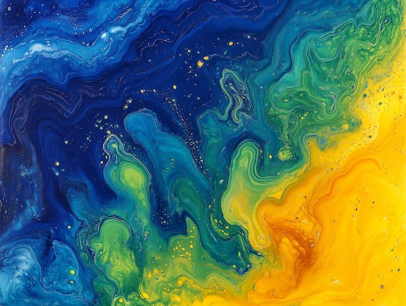
When working with analogous colors like blue, green, and yellow, you’re creating spaces that feel naturally balanced and harmonious. These combinations evoke the gentle transitions found in nature—think of a summer landscape with golden fields, green trees, and blue skies. This approach works beautifully when decorating living rooms or bedrooms where you want to maintain a sense of flow and serenity.
For spaces that demand attention, yellow’s complementary relationship with purple creates electric visual energy. This pairing works through the natural tension between opposites, creating a vibrant, creative atmosphere. Consider this combination for decorating home offices, art studios, or accent walls where stimulating visual interest enhances the function of the space.
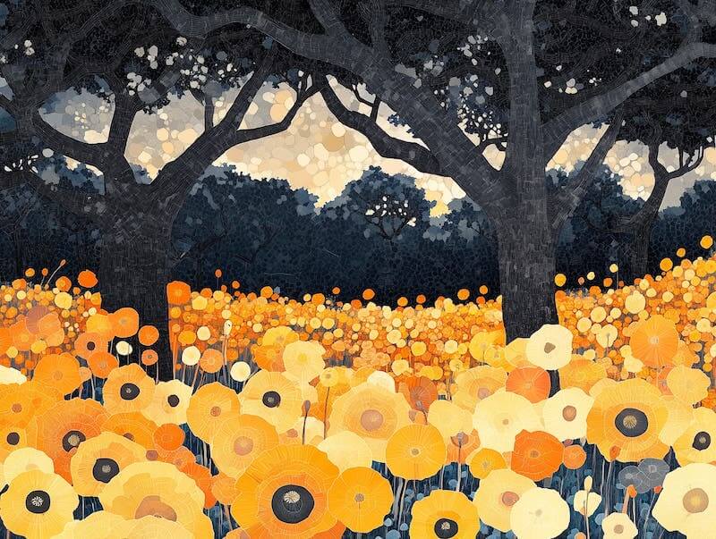
Yellow and Nature-Inspired Tones: Bringing the Outdoors In
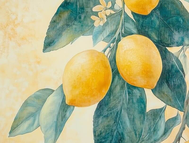
Why do yellow and green combinations feel so inherently pleasing? These pairings tap into our connection with the natural world, recreating the feelings we experience in outdoor settings where we feel most at ease.
Popular nature-inspired yellow combinations:
- Yellow + Sage Green – Creates serene, garden-inspired spaces with subtle sophistication
- Yellow + Rich Brown – Evokes natural wood and earth tones for grounded, warm environments
- Yellow + Terracotta – Captures Mediterranean and desert aesthetics for sun-baked warmth
- Yellow + Cream – Offers a soft, natural gradient reminiscent of sunlight on neutral surfaces
- Yellow + Olive – Provides a muted, organic feel perfect for creating calming retreats
When pairing yellow with sage or moss green, you’re essentially bringing spring indoors. This combination works particularly well in spaces where you seek both refreshment and relaxation. The yellow provides energy and optimism while the green grounds the space with natural tranquility.
For a more autumnal approach, combining yellow with warm browns like terracotta or chocolate creates a cozy atmosphere that feels particularly welcoming in living rooms and dining areas. These earthy tones help anchor yellow’s brightness, creating a palette that feels simultaneously vibrant and grounded.
To maintain a light touch while still incorporating natural elements, consider pairing yellow with cream or beige. This combination softens the overall look while maintaining warmth, offering a perfect foundation for minimalist or Scandinavian-inspired designs where simplicity and natural light are priorities.
Classic Yellow Pairings: Timeless Combinations That Never Fail
What makes certain color combinations endure decade after decade? The most timeless yellow pairings offer perfect balance—neither too trendy nor too safe—creating spaces that feel simultaneously fresh and established.
Timeless yellow color combinations:
- Yellow + Crisp White – Creates clean, bright spaces that feel perpetually fresh and airy
- Yellow + Navy Blue – Offers sophisticated contrast that works in both traditional and modern settings
- Yellow + Charcoal Grey – Provides contemporary neutrality with warmth and dimension
- Yellow + Black – Delivers dramatic definition and architectural emphasis with strong boundaries
- Yellow + Silver – Introduces a metallic element that adds modern sophistication to the warmth of yellow
The pairing of yellow and grey has become particularly popular in contemporary design because it strikes an ideal balance between warmth and sophistication. Grey acts as a perfect neutral backdrop that softens yellow’s intensity without diminishing its cheerful qualities. This combination works exceptionally well in multi-functional spaces like living rooms or home offices, where you want to create an environment that feels both professional and welcoming.
For spaces that need a fresh, clean feel, yellow and white remains a classic choice. This pairing amplifies light and creates an uplifting atmosphere, making it particularly suitable for decorating kitchens, bathrooms, or any space where cleanliness and clarity are priorities. The contrast between yellow’s warmth and white’s crispness creates a dynamic that feels perpetually bright and inviting.
Yellow and blue—from navy to sky blue—offers a contrast that feels simultaneously classic and energizing. This combination works across design styles, from nautical themes to contemporary settings, bringing both structure and playfulness to a space. Consider this pairing for decorating family rooms or children’s spaces where you want to create an environment that feels both organized and energetic.
Bold and Vibrant Combinations: Making a Statement with Yellow

When is a bold color combination the right choice? Statement-making yellow pairings work best in spaces where you want to stimulate conversation, creativity, or simply create a memorable impression that reflects your personality.
High-impact yellow pairings for statement spaces:
- Yellow + Royal Purple – Creates dramatic, regal contrast with creative energy
- Yellow + Hot Pink – Delivers playful, energetic spaces with youthful vibrancy
- Yellow + Crimson Red – Generates maximum visual excitement and warmth
- Yellow + Emerald Green – Combines natural and luxurious elements for rich, lively spaces
- Yellow + Electric Blue – Creates contemporary, energizing environments with visual movement
The combination of yellow and purple creates perhaps the most dynamic contrast possible. Sitting directly opposite each other on the color wheel, these complementary colors create visual electricity that immediately draws attention. This pairing works perfectly for accent walls, statement furniture pieces, or creative spaces where stimulating visual energy enhances the function of the room.
For those drawn to playful, whimsical aesthetics, yellow and pink create a joyful duo that instantly brightens any space. This combination works wonderfully in nurseries, creative studios, or any room where you want to inspire happiness and creativity. The key to making this pairing sophisticated rather than childish lies in choosing the right shades—consider mustard yellow with blush pink for a more mature take on this spirited combination, or play with different undertones like fuchsia vs. magenta.
Yellow and teal create a fresh, eclectic pairing that feels both contemporary and timeless. The cool depth of teal balances yellow’s warmth, resulting in a combination that works beautifully in both bohemian and modern design approaches. This pairing creates spaces that feel simultaneously sophisticated and playful, perfect for social areas where you want to inspire both comfort and conversation.
Soft and Subtle Contrasts: Yellow’s Gentler Side

How can you incorporate yellow without overwhelming a space? Softer yellow pairings allow you to harness this color’s warmth and optimism while maintaining a sense of calm and subtlety—perfect for spaces where relaxation is the priority.
Gentle yellow combinations for serene spaces:
- Pale Yellow + Lavender – Creates dreamy, romantic atmospheres with subtle contrast
- Butter Yellow + Sky Blue – Evokes sunny days and clear skies for cheerful yet calm spaces
- Lemon Yellow + Soft Grey – Offers contemporary sophistication with gentle warmth
- Pastel Yellow + Blush Pink – Delivers delicate, nurturing environments with subtle energy
- Light Yellow + Ivory – Creates barely-there color that enhances natural light with warmth
Pairing soft yellow tones with pastel pink or light blue creates a gentle, cheerful atmosphere perfect for spaces where calm is essential but you still want to maintain a sense of optimism. These combinations work beautifully in decorating bedrooms, nurseries, or reading nooks where relaxation meets gentle inspiration.
For a more contemporary approach to subtle yellow pairings, consider combining soft yellow with light grey. This creates a sophisticated backdrop that maintains warmth without demanding attention, making it ideal for minimalist spaces or rooms where other elements take center stage.
The combination of yellow with lavender introduces a subtle yet intriguing contrast. This pairing brings a dreamy, imaginative quality to spaces, working particularly well in creative areas or bedrooms where you want to inspire both relaxation and creativity. The soft contrast between these colors creates an environment that feels both calming and gently stimulating.
Practical Tips for Decorating With Yellow: From Theory to Reality
Translating color theory into actual design decisions can be challenging. Here’s how to apply yellow combinations effectively in real-world spaces to achieve professional results.
Strategic yellow application techniques:
- Consider intensity – Bright yellows work best as accents, while softer shades can cover larger areas
- Evaluate natural light – North-facing rooms benefit from warmer yellows; south-facing rooms can handle cooler tones
- Test before committing – Sample different yellow tones at various times of day to see how lighting affects them
- Use the 60-30-10 rule – Apply yellow as either your dominant color (60%), secondary color (30%), or accent (10%)
- Balance with neutrals – Incorporate grey, white, or beige to give the eye visual rest from yellow’s intensity
When introducing yellow to your space, consider starting with smaller elements like cushions, throws, or artwork before committing to larger applications like wall color or major furniture pieces. This approach allows you to experiment with different shades and intensities while gauging their impact on your space.
Remember that lighting dramatically affects how yellow appears. Natural light enhances yellow’s brightness and clarity, while artificial lighting—especially warm-toned bulbs—can intensify its warmth. Always test your chosen yellow in the actual space before committing to large-scale applications, as the same shade can appear dramatically different depending on your specific lighting conditions.
For a balanced approach, consider applying the designer’s 60-30-10 rule to your yellow color scheme. This principle suggests using your dominant color for 60% of the space (typically walls and large furniture), a secondary color for 30% (accent furniture and textiles), and an accent color for the remaining 10% (accessories and small details). Yellow can work beautifully in any of these three positions depending on how bold you want your space to feel.
Illuminate Your Home: Bringing Yellow Color Schemes to Life
Yellow brings unmatched warmth, energy, and optimism to interior spaces, acting as both a mood enhancer and a design statement. Whether you’re drawn to its natural pairings with greens and earth tones, its classic combinations with neutrals and blues, or its bold statements alongside complementary purples, yellow offers endless possibilities for transforming your home into a space that feels uniquely vibrant and welcoming.
The key to successful yellow integration lies in understanding both color theory and practical application—balancing yellow’s natural brightness with complementary or analogous colors while considering factors like lighting, space function, and desired atmosphere. With thoughtful planning and creative combination, yellow can transform any room from ordinary to extraordinary.