
Have you ever looked at a beautifully designed room and wondered how it all comes together so perfectly? One of the secrets interior designers swear by is the 60-30-10 rule. This is a tried-and-true formula for creating a balanced color palette. This simple guideline is the key to creating spaces that feel harmonious, polished, and visually appealing. Whether it’s a full makeover or a touch-up, understanding this rule can help you achieve stunning results when decorating your home.
The Basics of the 60-30-10 Rule

At its core, the 60-30-10 rule is about dividing a room’s color palette into three parts:
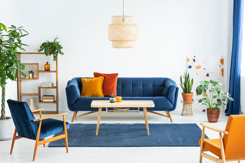
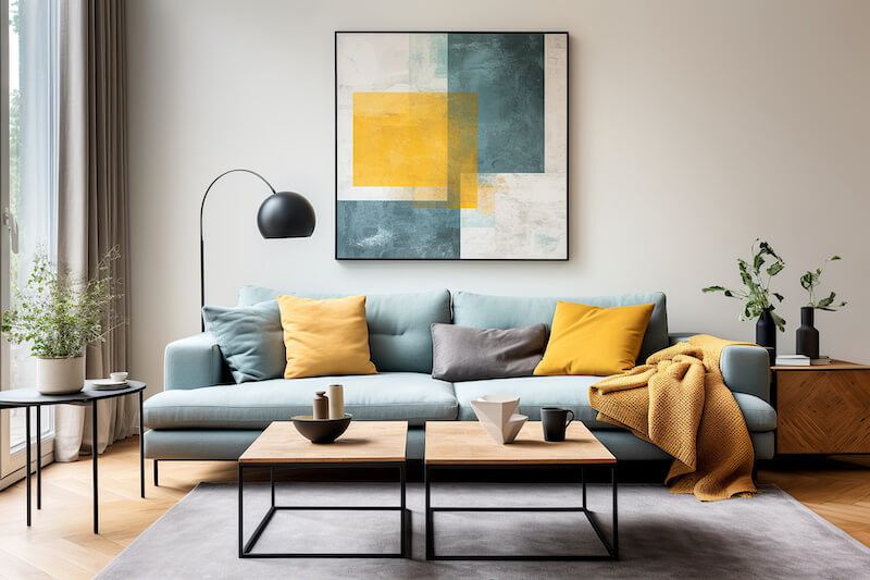
- 60%: The Dominant Color – This is the anchor of your design—the color that covers the majority of your room. Think of it as the backdrop that sets the tone for the space. Typically, this color is applied to walls, large furniture, or even flooring. Neutral tones like beige, gray, or white are common choices, but don’t be afraid to use a bold hue if that fits your style.
- 30%: The Secondary Color – This color supports the dominant shade, adding contrast and depth. It often appears in items like furniture, curtains, or area rugs. Your secondary color should complement the dominant color without overpowering it. For example, if your dominant color is a soft beige, your secondary color might be a calming blue or sage green.
- 10%: The Accent Color – Here’s where you can inject personality and vibrancy. The accent color is used sparingly but intentionally, showing up in smaller decor items like throw pillows, artwork, vases, or even a statement lamp. This color adds visual interest and can create a focal point in the room.
By dividing colors this way, the 60-30-10 rule ensures that no single hue dominates the space while allowing enough variety to keep things visually engaging.
Why the 60-30-10 Rule Works
The 60-30-10 rule is more than just a design trick; it’s rooted in the principles of balance and harmony. By assigning specific proportions to your color palette, you avoid the chaos of too many competing shades while also steering clear of a boring, monotone look.
The dominant color creates a unified foundation, while the secondary color adds richness and character. The accent color brings in just enough contrast to catch the eye without overwhelming the senses. This balance is what makes professionally designed spaces feel so effortless yet impactful.
How to Apply the Rule in Your Home
Using the 60-30-10 rule in your space is easier than you might think. Start by identifying the main functions of the room and the mood you want to create. Then, follow these steps:
Choose Your Dominant Color (60%)
Select a color that will act as the foundation for your design. Paint the walls, choose large furniture pieces, or lay down a rug in this hue. For a timeless look, opt for neutral colors—white walls are a classic, but warm and cool grays, beiges, and creams can lend themselves to different looks. If you prefer a bolder style, rich tones like navy blue or emerald green can make a dramatic statement.
Incorporate Your Secondary Color (30%)
Look for a complementary shade to balance your dominant color. Use this in mid-sized elements like sofas, accent chairs, bed linens, window treatments, or even an accent wall. For example, if your dominant color is gray, a mustard yellow or dusty pink secondary color can add warmth and depth.
Add Pops of Accent Color (10%)
Now comes the fun part! Use your third color to inject energy and personality into the room. This could be a vibrant red throw pillow, a piece of bold wall art, the picture frames of a gallery wall, or even a patterned vase. The key is to limit this color to about 10% of the space so it doesn’t overwhelm the design. Decorative accessories are perfect for this amount.
Choosing a Color Scheme for the 60-30-10 Rule
Before making new purchases, you need a well-thought-out interior design color scheme to guide your choices. With so many options, selecting the right colors can feel overwhelming, but a little planning and some basic design principles can make the process enjoyable and rewarding. Here’s how to approach picking a cohesive palette for your space.
Start With a Mood or Inspiration

The first step in choosing a color scheme is deciding the mood or feeling you want your room to convey. Colors aren’t just about aesthetics or favorites—they affect how a room feels. For example, cool neutrals, blues, and greens create a serene atmosphere. Earthy tones like terracotta, mustard, and warm neutrals are ideal for a warm and inviting feel. Vibrant shades like red, teal, or bright yellow add excitement and energy.
Color psychology can also help you choose colors that suit the space. For example, lighter colors can make a small space look larger, while dark colors can help a large room feel more cozy. Greens can throw off the lighting in bathrooms, while reds can stimulate your appetite in a kitchen.
Consider pulling inspiration from things you love—nature, art, travel photos, or even a favorite piece of furniture. A single item, like a patterned rug or painting, can serve as the foundation for your entire color scheme.
Use the Color Wheel
Once you have a main color, the color wheel is an invaluable tool for designing a harmonious palette. Here are a few popular approaches:
- Monochromatic Schemes: Use different shades, tints, and tones of a single color for a subtle, cohesive look. For example, a monochromatic blue scheme might feature a deeper shade of navy as the dominant color, slate blue as the secondary, and sky blue as the accent.
- Analogous Schemes: Choose colors that sit next to each other on the color wheel, such as blue, green, and teal. These schemes are naturally harmonious and easy on the eyes.
- Complementary Colors: Pair two colors opposite each other on the wheel, like blue and orange or purple and yellow. These combinations create high contrast and visual excitement, especially when used for accents. For more colors, you can take a split-complementary approach: for example, purple, yellow-green, and yellow-orange.
- Triadic Schemes: Select three colors evenly spaced around the wheel, such as yellow, blue, and red. This approach provides a lively, balanced palette.
There are many online tools to let you play with the color wheel and visualize different color schemes.
Tips for Success With the 60-30-10 Rule
Here are some practical tips to get the most out of the 60-30-10 rule:
Use Neutrals as Your Background
Neutral colors like white, beige, or gray provide a flexible canvas. You can easily swap out secondary and accent colors to refresh the look over time.
Play With Textures
If your color palette is simple, use textures to add dimension. For example, pair a smooth leather sofa (dominant color) with a velvet armchair (secondary color) and a woven throw pillow (accent color).
Pull It All Together
Having a focal point that has elements of all your chosen colors is a great way to tie a room together, especially if the colors don’t naturally go together. For example, if you have a favorite piece of wall art or a patterned rug, you can pick your colors out of it.
Test Colors in Your Space
Colors can look different depending on lighting. Test your choices in the actual room, both during the day and at night, to ensure they work well together.
- Paint sample swatches directly on the wall and observe them at different times of day.
- Gather fabric or decor samples to see how the colors interact with textures and patterns.
- Create a mood board with all your chosen colors, furniture, and decor items to visualize the final look.
By taking the time to plan your color scheme thoughtfully, you’ll set the stage for a successful application of the 60-30-10 rule, ensuring the space feels cohesive, intentional, and unique.
Ready to Build Your Color Palette?
The 60-30-10 rule is a simple yet powerful tool for creating beautiful, balanced spaces. By dividing your colors into dominant, secondary, and accent categories, you can design rooms that feel cohesive and inviting. Whether you’re starting with a cozy grey living room or a bright, modern kitchen, this rule can guide your decisions and help you achieve professional-level results.