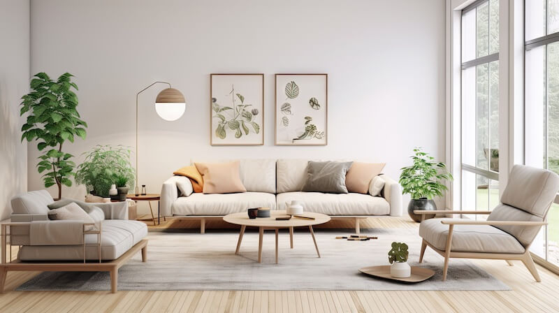
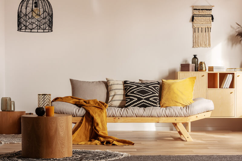
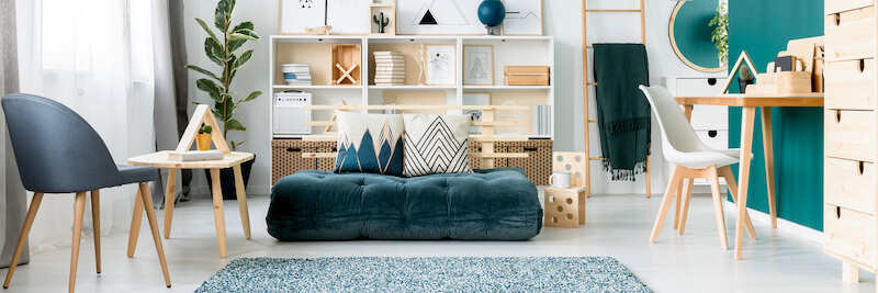
Scandi style is a force to be reckoned with in the interior design world, but why do these serene, muted tones have such widespread appeal? The Scandinavian color scheme is more than just aesthetics; it reflects a lifestyle that values simplicity and harmony with nature. With a focus on whites, creams, and soft greys, it enhances natural light and creates a calming atmosphere. But there’s more to uncover about the earthy accents that make up this unique palette.
Highlights of the Scandinavian Color Palette
- Scandinavian color palettes emphasize neutral base colors like whites, creams, and soft greys for calm, versatile interiors.
- Nature-inspired tones like muted greens and blues evoke serenity and connect interiors to natural landscapes.
- Earthy accents like rust and terracotta add warmth and complement the neutral foundation.
- Light-reflecting whites and greys enhance brightness, which is crucial for Scandinavian spaces during long, dark winters.
- Modern adaptations incorporate bold accents like forest green and burnt orange to enrich traditional palettes with vibrancy.
Origins of Scandinavian Colors

The essence of Scandinavian colors is deeply connected to the region’s natural landscapes, which inspire the palette’s serene and muted tones. These muted colors capture the tranquility and simplicity of nature, which is central to Scandinavian living.
Incorporating natural materials like light woods and stone further enhances this connection to the earth. These elements blend seamlessly with the neutral and earthy colors that define the palette, such as whites, soft greys, and beiges. It’s about creating an inviting atmosphere that feels both fresh and calming, essential during the long, dark winters.
The historical influence of the Bauhaus movement in Scandinavia emphasized simplicity and functionality, leading to the widespread use of these neutral tones. However, the palette doesn’t shy away from bold accents. You might find touches of forest green or burnt orange, adding warmth and reflecting the region’s seasonal changes. This approach maintains a minimalist aesthetic that feels connected to nature.
Key Elements of the Palette
To execute the Scandinavian color palette, start with neutral base colors, like whites, creams, and soft greys, which set a tranquil foundation. Add muted tones such as soft pinks and blues for a touch of personality without disrupting the calm. To complete the look, incorporate earthy accents like rust and terracotta, which connect the space to nature and provide depth.
Neutral Base Colors

Scandinavian design’s hallmark is its reliance on neutral base colors like whites, creams, and soft greys. These shades create a versatile foundation that integrates accent colors and natural materials. Light grey and soft greys reflect natural light to brighten interiors, especially during the long, dark Nordic winters.
Though similar to an accented neutral color scheme, which features bold accent colors, a Scandinavian palette is typically complemented by more subtle pops of color.
Neutral base colors aren’t just about simplicity—they also bring warmth and depth to the space. Incorporating beige tones alongside light greys adds a subtle warmth, making your home feel cozy and inviting. These colors are perfect for fostering a connection with nature, a key aspect of Scandinavian design.
Muted pastels are often used as accent colors within this palette, allowing you to inject personality and character into the room without disrupting the minimalist aesthetic. These pastels complement the neutral base, adding a touch of whimsy and softness. By sticking to a palette dominated by neutral base colors, you’re establishing an environment that is both comforting and adaptable, ideal for a doctor’s office and keeping a room low-key.
Muted Tones
Muted tones play a central role in the Scandinavian color palette, enhancing your home’s serene and calming atmosphere. Soft greys, pale beiges, and gentle pastels help create a tranquil and inviting space. By incorporating these muted tones, homeowners can achieve a minimalist aesthetic that doesn’t overwhelm the senses.
The Scandinavian color palette thrives on its ability to reflect and amplify natural light, especially in regions where sunlight is scarce during the colder months. Neutral hues act as a foundation, allowing muted tones like dusty pinks, muted greens, and light blues to subtly evoke a connection to nature and the changing seasons.
Earthy Accents

Incorporating earthy accents into a Scandinavian color palette enriches the aesthetic with warmth and a touch of nature. Adding muted tones like rust orange, sage green, and terracotta can evoke a natural and organic feel in your interiors. These earthy accents complement the predominantly neutral colors that define Scandinavian design, but be sure to follow the 60-30-10 rule for a balanced color palette.
To integrate these earthy accents, consider using accessories. Cushions, wall art, or decor are great ways to introduce these tones without overwhelming the minimalist aesthetic. This adds visual interest and reflects seasonal changes, bringing the outside in. It’s all about creating a space where every element feels intentional yet effortlessly stylish.
Nature-Inspired Tones
Nature serves as a strong source of inspiration in the Scandinavian color palette, infusing interiors with muted greens, browns, and soft blues. Thankfully, there are many shades and colors that go with green, and the Scandinavian palette’s base colors are no exception. These nature-inspired tones echo Scandinavia’s vast forests and calm waters. Colors like forest green and soft blues bring a sense of calm and connection to the outdoors.
To complement these colors, use natural materials such as light woods and textiles. They seamlessly blend with the nature-inspired tones, enhancing the organic feel of Scandinavian interiors. Light-reflecting whites are often paired with these earthy hues to maximize natural light.
Modern Adaptations

While nature-inspired tones form the backbone of the Scandinavian palette, modern adaptations often utilize bolder accent colors. By incorporating hues like forest green and burnt orange, Scandinavian design maintains its bright and airy essence while adding a touch of vibrancy.
Modern adaptations also introduce contemporary trends, blending traditional Scandinavian hues with earthy tones and ethnic patterns. These elements create a more eclectic aesthetic without compromising the simplicity of Scandinavian design. Blues and yellows are increasingly popular, reflecting a lively approach to interiors.
In these updated interpretations, layering textures and colors is key. This technique allows you to express personal style within the minimalist framework, ensuring spaces remain functional and visually appealing. By focusing on light, neutral colors, homeowners can enhance natural light and make their homes feel even more open and welcoming.
Transform Your Space into a Scandinavian Oasis
If you’re choosing a color palette for your home, be sure to consider the calming, natural feel of the Scandinavian palette. The heart of a Scandinavian color palette is a gentle embrace of nature’s simplicity, where the earthy greens and soft pastels symbolize a soothing connection to the world outside. By incorporating these elements into their space, homeowners can craft their own unique atmosphere that is bright, open, and connected to nature.


