
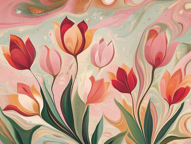
What is the secret to creating a room that feels both refreshed and refined? It might be as simple as adding green interior design elements. The most abundant color in nature has an almost magical ability to transform your home, bringing life to neutral spaces.
Have you ever noticed how a walk through a lush garden instantly lifts your mood? That’s the power of green’s color psychology. Whether you’re drawn to the deep, mysterious emerald of a forest at dusk or the soft sage of spring mornings, the right green paired with the perfect color companions can completely reinvent a room.
A space with thoughtfully incorporated green doesn’t just look different—it feels different. Explore how different color combinations can unlock green’s full potential and help you find the perfect artwork to decorate your home.
The 5-Minute Green Refresh:
Want to transform a space with green instantly? Here’s your quick-action plan:
- The 60-30-10 Rule: Use green for 30% of your room (a statement wall, large artwork, or furniture piece), neutral tones for 60%, and an accent color for the final 10%.
- The Art Anchor: Select a landscape or original green artwork for sale featuring your preferred green shade, then pull three colors from the artwork for your room’s palette.
- The Nature Connection: Place a green element within eyesight of your entryway—whether artwork, plants, or decor—to create an immediate sense of welcome and calm.
- The Texture Secret: Pair smooth green surfaces (like glass or velvet) with contrasting textures (like rattan or linen) to add depth without additional colors.
- The Lighting Trick: Green looks dramatically different depending on light—test a paint sample or fabric swatch at morning, afternoon, and evening to ensure you’ll love it around the clock.
Finding Your Perfect Green Palette
What feeling do you want to experience when you walk into your room? The beauty of green living room ideas lies in how each shade shifts personality depending on its companions. A peaceful sanctuary? An energizing creative space? A cozy retreat? Green can deliver all of these moods through thoughtfully selected green color palettes for home—it’s all about what you pair it with.
Green Palette Cheat Sheet
- Neutrals: White, black, grey, cream, and beige keep your design clean, flexible, and timeless—perfect for letting green artwork become the conversation piece.
- Analogous colors: Blues and yellows naturally complement green, creating a harmonious flow that feels like a breath of fresh air.
- Complementary colors: Red tones (think terracotta or blush) create that dynamic tension that makes both colors sing—like flowers blooming against lush foliage.
- Earthy accents: Shades such as cinnamon, tan, and rust enhance green’s organic beauty, creating spaces that feel rooted and authentic.
- Bright pops: Orange, coral, or sunny yellow against green background creates those unexpected moments of joy that make a room unforgettable.
Modern Nature: Sweet Sage and Spice
Colors in this palette:
- Pistachio green
- Deep sage green
- Reddish-orange
Remember walking into that café where time seemed to slow down? That feeling probably came from a palette like this one. Sweet Sage and Spice blend the gentle reassurance of pistachio and deep sage with unexpected touches of reddish-orange that wake up your senses.
This combination works magic in spaces where you want to feel both calm and inspired. Picture decorating a kitchen where soft sage cabinetry meets a terracotta backsplash or a reading corner where an emerald green decor accent like a velvet chair sits beneath a rust-colored abstract painting. The earthy warmth balances the coolness of green, creating a space that feels like it’s embracing you.
Try hanging landscape paintings with green rolling hills and touches of amber sunset to bring this palette to life on your walls. The natural textures of linen, raw wood, and handmade ceramics enhance this palette’s organic charm, especially when paired with green and gold wall decor accents.
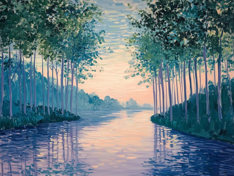
Ocean-Inspired: Coastal Escape
Colors in this palette:
- Deep green
- Soft seafoam green
- Sunny yellow
- Pale blue
Close your eyes and imagine standing at the edge of the ocean—that’s the feeling this palette captures. The deep greens of seaweed and distant shores ground the lighter, airier tones of seafoam, creating a balance that feels both refreshing and serene.
What makes this combination truly special is how it changes throughout the day, much like the ocean itself. Morning light brings out the crisp, awakening qualities of the pale blues and seafoam, while evening light enhances the cozy depth of the deeper greens.
A large-scale seascape or green abstract canvas art featuring these coastal hues becomes an instant window to the shore, no matter how far inland you might be. Pair with natural textures like rope, weathered wood, or seagrass to complete the journey.
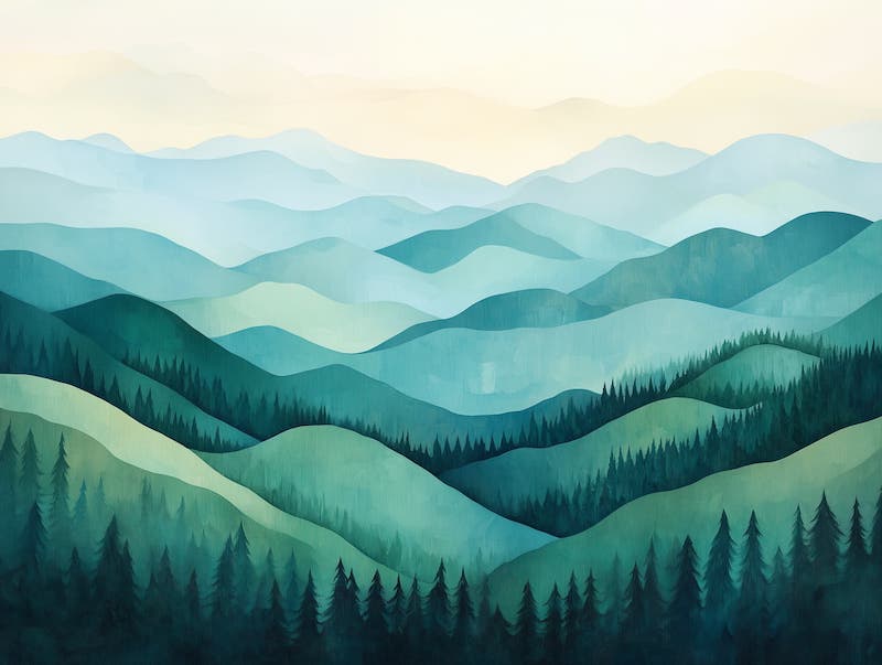
Whimsical Charm: Enchanted Forest
Colors in this palette:
There’s something utterly transporting about stepping into a space that whispers of fairytales and secret gardens. The Enchanted Forest palette brings that touch of magic through an unexpected marriage of deep, mysterious greens with the surprise of lavender—like wildflowers appearing in a woodland clearing.
This combination creates rooms that feel both grounding and dreamy, perfect for spaces where imagination matters. A child’s bedroom transforms into a storybook setting, while a home office becomes a place where creativity flows effortlessly.
A moody forest scene or framed botanical illustrations with touches of purple flowers would capture this palette’s essence perfectly. When balanced with natural stone or reclaimed wood elements to create a green gallery wall idea, the result is sophisticated whimsy that never feels childish.
Bold and Vibrant: Jewel of the Jungle
Colors in this palette:
- Forest green
- Bold orange
- Coral
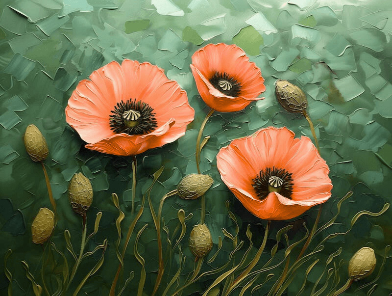
Have you ever noticed how the most breathtaking moments in nature often involve contrast? Think of tropical flowers blazing against dense greenery. That’s the energy the Jewel of the Jungle palette brings into your home—forest green creates that lush, sheltering feeling, while pops of orange and coral deliver moments of pure joy.
This dynamic combination works wonders in spaces that need energy and conversation. Decorating a dining room with forest green walls and coral artwork creates a backdrop for memorable gatherings. Even just a few orange accessories against green furniture can transform a neutral room into something extraordinary.
Look for vibrant statement art for green rooms or tropical botanical prints that capture this palette’s lively spirit. The contrast creates an instant focal point that draws the eye and lifts the mood, particularly when selecting art pieces that complement green furniture.
Energetic Balance: Evergreen and Ember
Colors in this palette:
- Deep evergreen
- Vibrant red
- Burnt orange
- Soft pink
There’s something almost magnetic about the combination of green and red—opposite on the color wheel but complementary in spirit. The Evergreen and Ember palette harnesses this natural tension, creating spaces with undeniable energy and warmth.
Unlike the holiday associations you might first think of with red and green, this palette feels sophisticated when the red leans toward burnt orange or when soft pink is introduced as a buffer. The result is rooms that feel both grounded and alive—perfect for spaces where conversation and connection happen.
A still life with rich greens and touches of red fruit or an abstract piece playing with these complementary tones would anchor this palette beautifully. For those wondering how to choose art for sage green walls, these pieces create a perfect balance. Natural materials like terracotta, copper, and raw wood enhance the earthy quality while keeping the energy balanced.
Green for Different Design Styles
Green’s remarkable adaptability means it works across virtually any design style. Here’s how to make it shine in your preferred aesthetic:
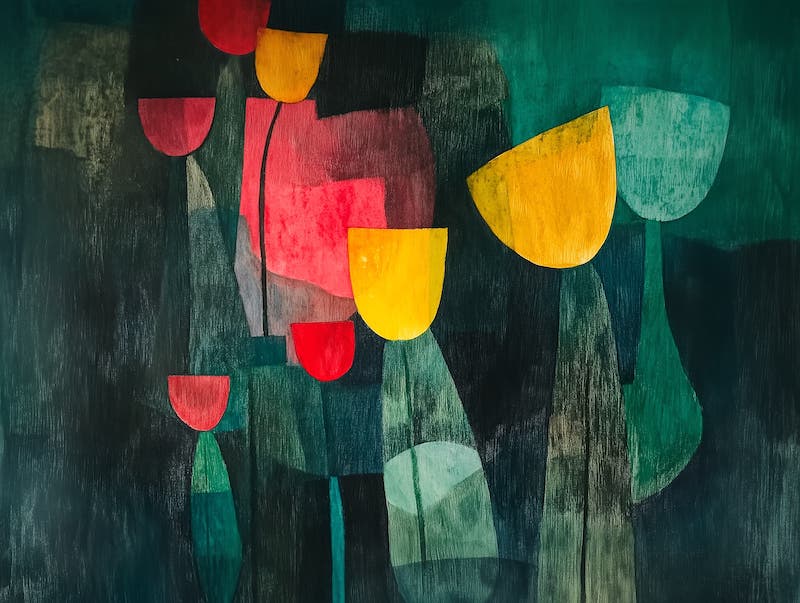
Modern and minimalist: Embrace the dramatic contrast of deep emerald or forest green accent wall against crisp whites and light woods. Think bold, graphic art pieces featuring single green leaves or green abstract art for minimalist spaces with strong elements against neutral backgrounds. The clean lines and purposeful simplicity let the richness of green become a focal point rather than overwhelming the space.
Bohemian and eclectic: Green is the perfect anchor for bohemian spaces that celebrate collected treasures and global influences. Pair sage green with warm terracotta, mustard yellow, or rich cinnamon. Look for botanical prints, landscape paintings with verdant hills, or abstract pieces that incorporate earthy greens alongside warm complementary colors. The natural element of green helps unite the various textures and patterns that define bohemian style.
Farmhouse and rustic: Soft, weathered greens like sage, moss, or muted olive bring instant warmth to farmhouse spaces. Making a gallery wall of vintage botanical illustrations, countryside landscapes, or abstract pieces in these gentle green tones complements the authentic, lived-in quality of rustic design. The connection to nature strengthens the honest, unpretentious feel that makes the farmhouse style so inviting.
Industrial chic: The rawness of industrial spaces—exposed brick, concrete, metal—finds perfect balance with deep green elements. A large-scale photograph of forest canopy or abstract art featuring hunter or forest green softens the hard edges while maintaining the bold, confident aesthetic. Green becomes the vital organic counterpoint to industrial manufactured elements.
Coastal and nautical: Light, breezy seafoam or mint green paired with crisp whites and sandy beiges instantly evokes shoreline tranquility. Seascapes featuring the meeting of blue waters with green landscapes, abstract pieces suggesting horizon lines, or botanical prints of coastal vegetation all enhance the fresh, airy quality of coastal wall decor.
Mid-century modern: Green was essential to mid-century design, with its bold olive and avocado tones. Graphic prints featuring geometric forms in these distinctive greens, abstract landscapes with mid-century color palettes, or botanical illustrations with a retro sensibility all complement the clean lines and organic curves of this timeless style.
Luxury and glam: Nothing says sophistication quite like emerald green. Dramatic abstract pieces featuring this jewel tone, still lifes with rich green elements, or landscapes with deep forest tones all enhance the plush, indulgent nature of luxury interiors. When paired with gold frames or against dark walls, green artwork becomes even more striking.
Scandinavian: Muted, gentle greens alongside the characteristic whites and light woods of Scandinavian color palettes create spaces that feel both fresh and cozy. Minimalist landscapes featuring northern forests, simple botanical illustrations, or abstracts with soft green elements respect the “less is more” philosophy while adding that crucial connection to nature.
Tips for Decorating with Green
If you’re just beginning your green journey, here are some thoughtful starting points:
- Start with art ideas: A beautiful piece featuring your preferred shade of green can inspire an entire room’s palette. Let the specific green tones in the artwork guide your paint, textile, and accessory choices.
- Balance the intensity: The more profound and bolder your green, the more it benefits from neutral companions like grey. An emerald green statement piece needs breathing room to shine, while lighter greens can handle more colorful companions.
- Layer your greens: Nature rarely shows just one shade of green—multiple tones create depth and interest. Don’t be afraid to mix sage with emerald or forest with mint, especially in your art selections.
- Consider the light: Northern light brings out the blue undertones in green, while southern exposure enhances the yellower notes. East-facing rooms showcase green’s crispness in the morning, and western rooms make greens glow warmly in the evening.
- Think seasonally: Green is uniquely adaptable through the seasons. Pair it with fresh whites and yellows in spring, vibrant blues in summer, rich oranges and browns in autumn, and deep reds or metallics in winter.
Unlock Green’s Transformative Power
There’s a reason we’re innately drawn to green—it connects us to the natural world in ways both subtle and profound. Whether you’re seeking the peaceful reassurance of sage green home accessories, the sophisticated drama of emerald, or the fresh optimism of mint, green brings living energy into your space through carefully selected framed green prints online.
The artwork you choose becomes the heart of this transformation. A verdant landscape that captures your favorite hiking spot, an abstract that plays with forest and moss tones, or a botanical illustration that celebrates green’s infinite variations—each creates a different feeling, a different story.
What story will your space tell? Which shade of green speaks to your vision? The journey to discovering your perfect green palette starts with a single piece that moves you. Look for that artwork that makes you pause, that resonates with something deeper than trend or fashion. That’s your starting point for bringing green’s remarkable properties into your everyday life.
Your walls are waiting to be transformed. Green is ready to bring them to life.