
Standing in your room with a pink paint swatch. Wondering if it’ll work or just look childish. Sound familiar?
Pink isn’t just for nurseries anymore. This versatile color can be bold, sophisticated, or perfectly serene depending on what you pair it with.
Let’s explore color combinations that make pink shine in any space—no design degree required.
Quick Pink Pairings You Can Use Today
- Need energy? Pink + yellow or orange creates vibrant, cheerful spaces
- Want elegance? Pink + gold or navy adds instant sophistication
- Craving calm? Pink + sage green or soft grey creates peaceful balance
- Looking for drama? Pink + black makes a bold statement without trying too hard
- Love natural vibes? Pink + green brings the outdoors in
Bookmark this for your next project or text it to a friend stuck in a beige rut.
Pink + Red: Not Too Much

Forget the old rules about not mixing these neighbors. Pink and red together create depth that feels intentional, not accidental.
Try a blush pink accent wall with ruby red pillows. Or mix different tones from pale pink to deep crimson for richness that doesn’t overwhelm.
Works best in: Dining rooms or bedrooms where warmth matters.
Quick tip: Add cream or light wood to break up the intensity. Otherwise, things get Valentine’s Day real fast.
Pink + Orange: Instant Happy

Nothing says cheerful like this sunny combo. The warmth of both colors creates spaces that feel alive and welcoming.
Add coral throw pillows to a pink couch. Paint an orange side table to complement pink walls. Even small touches bring immediate warmth.
Perfect for: Creative spaces or anywhere that needs energy.
Quick tip: Ground the brightness with white or neutral elements. Your guests need visual rest spots between color moments.
Pink + Green: Nature’s Favorite
These complementary colors create natural balance. From soft sage to bold emerald, green brings out pink’s best qualities.
Soft pink walls with olive furniture feels surprisingly sophisticated. Or try emerald accents against blush for preppy elegance without trying too hard.
Ideal in: Living rooms or bedrooms that need a nature connection.
Quick tip: Look at flowers for inspiration – nature pairs these colors perfectly. Add actual plants with pink-tinted leaves like caladium, nerve plant, or arrowhead plant to drive the point home.
Pink + Yellow: Instant Sunshine

This combo brings immediate happiness. No design theory needed—it just works.
Try light pink walls with mustard yellow accents. Or scatter bright yellow pillows on a pink sectional. Simple changes, big impact.
Works best in: Home offices, craft rooms, or anywhere creativity happens.
Quick tip: Add natural textures like rattan or linen. Prevents the combo from looking like a candy shop.
Pink + Gold: Grown-Up Glam
The most sophisticated pink pairing doesn’t try too hard. Gold adds warmth without flashiness.
Pink velvet with gold hardware. Gold-framed mirrors against pink walls. Mixing matte and shiny gold finishes adds depth worth noticing.
Perfect for: Living rooms or bedrooms that need a touch of luxury.
Quick tip: Stick with blush or dusty pink for subtle sophistication. Hot pink with gold makes a bolder statement—neither approach is wrong.
Pink + Grey: Quiet Confidence

This pairing feels both current and timeless. Versatile enough for any room, yet never boring.
Soft pink walls with grey furniture creates instant elegance. Layer different pink tones against grey for dimension that doesn’t shout.
Works beautifully in: Bedrooms or living spaces where calm matters most.
Quick tip: Pay attention to your grey’s undertones. Warm greys with pink hints create harmony. Cooler greys with blue notes create more contrast. Both work, just differently.
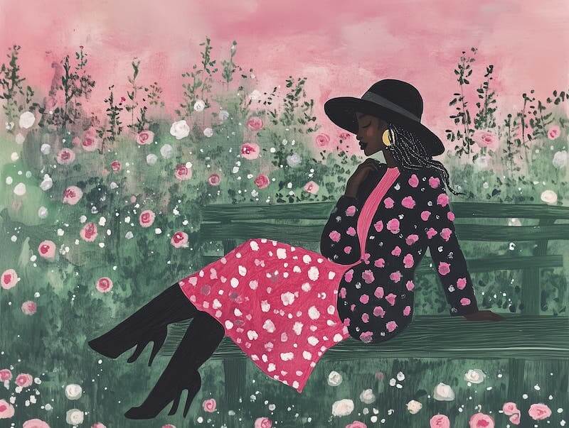
Pink + Black: Not Afraid to Stand Out

High-contrast and confident. This pairing commands attention without being difficult to live with.
Black window frames against pink walls. A pale pink sofa facing a black accent wall. Even small touches of black add immediate sophistication to pink rooms.
Ideal for: Home offices or dining spaces that benefit from confident design.
Quick tip: Let one color lead. Roughly 70% dominant color with 30% accent creates the most successful balance. If you have a third color, go 60-30-10.
Pink + Sage: The Peaceful Pairing

This garden-inspired combo creates spaces that instantly lower blood pressure. No meditation app required.
Sage walls with pink textiles. Or flip it with pink walls and sage furniture. Either approach brings natural tranquility. Stick it with turquoise for a great Southwest color palette.
Perfect in: Bedrooms, reading corners, or bathrooms meant for relaxation.
Quick tip: Add white accents to keep things fresh rather than dusty.
Pink + Navy: Surprisingly Perfect Balance

This unexpected combo creates rooms with depth and character. The balance between warm and cool tones feels sophisticated without trying.
Navy blue walls with pink accents. Pink upholstery with navy pillows. Either approach works beautifully.
Shines in: Living rooms or dining spaces that need balanced contrast.
Quick tip: Add brass or gold accents to warm up this color scheme even more.
Pink + White: Clean Simplicity

When you want pink to be the star, white creates the perfect supporting cast. Fresh, clean, and always works.
Pink walls with white furniture. Pink bedding against white walls. The contrast feels intentional yet effortless.
Works anywhere: Especially kitchens, bathrooms, or bedrooms.
Quick tip: Add natural textures like cotton or jute. Prevents the pairing from feeling sterile or flat.
Pink + Teal: Playful but Sophisticated

An unexpected combo that creates immediate personality. Balances warm and cool tones in a way that feels intentional, not random.
Use either as your main color with the other as accent. Or try color-blocking for modern appeal that doesn’t take itself too seriously. A lot of shades of pink go with teal—bubblegum, coral, peachy, hot. Pick your favorite.
Perfect for: Guest rooms or spaces where conversation matters.
Quick tip: The specific shades dramatically change the mood. Pastels create soft, approachable spaces. Saturated tones make bolder statements. Neither is wrong.
Make Pink Work For You
Pink adapts to almost any style. Drama with black. Tranquility with sage. Elegance with gold. Each pairing expresses something unique about your home.
Before committing:
- Test samples in your actual space. Light changes everything.
- Start small if you’re nervous. Pillows and artwork are low-commitment pink compared to painting all your living room walls.
- Remember that different pinks create completely different moods. Blush feels different than magenta. Both have their place.
The best thing about designing with pink? Its adaptability. Start with these combinations, then adjust to create an interior design palette that feels uniquely yours. Spaces that welcome, inspire, and actually feel like home.
Which pink pairing speaks to you? The perfect match is waiting.