
Red is bold, vibrant, and undeniably attention-grabbing—a color that exudes confidence and passion. It’s no wonder red is a favorite in both fashion and interior design color palettes. But pairing red with other colors can feel like walking a fine line between striking and overwhelming. While classic pairings like red and black are timeless, a whole spectrum of possibilities is waiting to be explored. Whether you seek sophistication, warmth, or energy, the right color combination can elevate red to its full potential. Let’s dive into the world of red and discover how to make it shine.
5 Ways to Use Red in Interior Design
- Black enhances red’s boldness for a dramatic, sophisticated look.
- White and cream soften red’s intensity, creating balance and brightness.
- Navy blue and teal bring a timeless, elegant contrast to red.
- Bright yellow or hot pink adds playful energy and boldness.
- Balancing red with calming colors like grey and blue helps keep this bold color from overwhelming a room.
Red’s Analogous and Complementary Colors
Red has a dynamic relationship with its neighboring colors on the color wheel—orange and purple—as well as its direct opposite, green, its complementary color. Each pairing offers a unique way to harness red’s energy and versatility.
Analogous Colors: Orange and Purple

Red and Orange: This pairing is all about warmth and vibrancy. The fiery energy of orange enhances red’s boldness, creating a lively and cohesive palette. Think of sunset-inspired designs with red walls accented by orange furnishings or decor. This combination is perfect for social spaces like living rooms or dining areas where you want to evoke energy and connection.
Red and Purple: Purple brings a touch of elegance and mystery to red’s intensity. Together, they create a bold and dramatic look that’s both playful and sophisticated. Deep shades like wine red and plum are ideal for luxurious interiors, while brighter tones like crimson and lilac add a creative, artistic flair to any space.
Complementary Color: Green
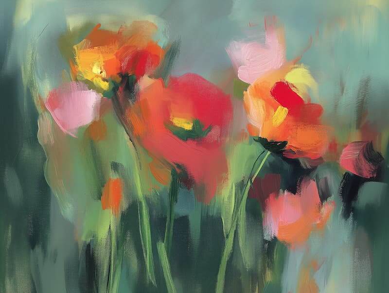
As opposites on the color wheel, red and green create a striking, high-contrast pairing. This duo is famously associated with Christmas decor, but it can work year-round when balanced thoughtfully. For a fresh, modern take, pair a deep red with olive or sage green for a more subdued and natural aesthetic. Alternatively, use vibrant red and emerald green for a bold, energetic look in fashion or decor.
By exploring red’s analogous and complementary colors, you can create palettes that range from harmonious and cozy to bold and dramatic, giving you endless possibilities for design and styling.
Classic Neutrals With Red
Neutrals are a foolproof way to let red take center stage. Whether paired with black, white, or cream, red gains a polished and timeless look—And there’s no bolder color than red to pop in an accented neutral color scheme.
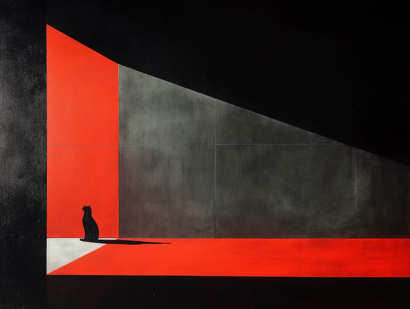
- Red and Black: This high-contrast combo is dramatic and sleek, perfect for formal settings. Imagine a room with black furniture and red accents—it feels bold, luxurious, and confident.
- Red and White: Crisp white lightens red’s intensity, creating a fresh and modern look. This is a great choice for kitchen decor or spaces where you want energy without overwhelming the eye.
- Red and Cream: For a softer, more inviting feel, pair red with cream. This warm combo is ideal for creating cozy spaces like a living room or dining area.
Bold Color Pairings

If you want to make a statement, bold color combinations that enhance red’s natural energy will do the trick.
- Red and Navy Blue: This classic pairing balances red’s vibrancy with navy’s calm sophistication. It’s perfect for creating timeless, elegant designs.
- Red and Yellow: Bright and energetic, this pairing brings cheer to any room. Use it in kitchens or playrooms for a lively atmosphere.
- Red and Teal: Teal’s cool tones balance red’s warmth, creating a dynamic and refined aesthetic. This combination is ideal for art deco or eclectic styles.
- Red and Hot Pink: A bold and playful duo, red and hot pink bring an element of chic drama to modern spaces or fashion-forward outfits.
Red and Calming Colors
Pairing red with calming hues like cool grey or soft blue tones can balance its boldness, creating a harmonious and serene environment. Cool grey, in particular, serves as a neutral anchor that softens red’s intensity, making it feel less overwhelming while maintaining a modern and sophisticated vibe.
- Red and Cool Grey: This pairing is perfect for contemporary spaces where you want to add a pop of warmth without compromising on tranquility. A living room with red accent pillows against a grey sofa or a dining area featuring red chairs with a grey table can achieve a polished yet calming look.
- Red and Soft Blues: Light blue tones, such as sky blue or powder blue, offer a refreshing contrast to red. This duo evokes balance and a touch of playfulness, ideal for decorating bedrooms or creative spaces.
Red and Earthy Colors
Red pairs beautifully with earthy tones like terracotta, olive green, and warm browns, creating a grounded and cozy atmosphere when used to decorate your home. These combinations draw inspiration from nature, making them ideal for rustic interiors.
- Red and Terracotta: This duo captures the warmth of sunlit clay, making it perfect for bohemian or Mediterranean-inspired designs. Think of red accent walls paired with terracotta pots or rugs for a cohesive look.
- Red and Olive Green: Olive’s muted green tones provide a natural counterbalance to red’s intensity, resulting in a palette that feels both organic and dynamic. This combination works wonderfully in kitchens or dining rooms where you want to foster a warm, inviting vibe.
- Red and Warm Browns: Shades like chocolate, mahogany, or caramel pair effortlessly with red, enhancing its richness. This earthy combination is ideal for cozy living rooms or rustic cabins, where warmth and comfort take center stage.
Unleash the Power of Red in Interior Design
Red is more than just a color—it’s a statement. Whether paired with classic neutrals, bold contrasts, or soft shades of its own family, red transforms spaces and outfits with its energy and sophistication. By adding textures and patterns and paying close attention to the 60-30-10 rule to keep this bold hue from overwhelming a room, you can tailor red to suit any style or season. So, don’t shy away from experimenting—red’s versatility means the possibilities are endless!